What is the one thing you desire most when you are dinning with family in a popular food joint? Quality or simply food quality, right? What is it that you look when you are buying a gazette or dress or anything for which you are paying from your pocket? Is it Quality? Yes, that is right…it is the quality that you look for in everything your buy or pursue.
How do you know or measure quality in the products or services you are delivering to the client? How do you know your processes are working as you expected? There are tools available to measure the qualities. There are Seven popular qualities tool available which are used worldwide to measure or observer the qualities in various industries such as IT, manufacturing, Publishing etc.
These 7 basic tools of quality are following:
1. Ishikawa diagram
2. Check sheet
3. Control chart
4. Histogram
5. Pareto chart
6. Scatter diagram
7. Flow chart
Today I learn about one of the quality tool called XMR chart. XMR stand for X – Individual and MR – Moving Range i.e. Individual and Moving Range Chart.
When XMR chart was invented?
The control chart concept was introduced to the world by Honorable Mr. Walter A. Shewart. He proposes this while working for Bell Labs.
So what exactly is XMR Chart?
XMR or I-MR chart is type of Control chart. This chart is used to observe or monitor one single data item. This single data item can be anything such as individual salesman productivity, an employee attendance or a production support team ticket resolution time etc. The single data item can be observed or monitored on weekly, monthly or yearly basis.
XMR is a type of Control Chart which is used for observing single data point. In other words XMR chart is use to observe one single item in a given time period or in a given data range.
The second important consideration about XMR chart is that data points are independent of each other. By observing one data point you cannot predict what the next data point will be. In other words by observing productivity of one day of an employee you cannot say what the productivity will be next day.
XMR Moving Range observes differences between data points. The range of the data points could be either the two (consecutive data points) or more. The simplest is to use range of two consecutive data points. This is called Moving Range of 2. For example, if you have an employee productivity data like following.
The moving range of 2 data points differences are shown in the above picture.
In case you are using range of more than two data points, then the minimum and maximum data point’s in the range are taken into calculation. For example if we have to calculate the moving range of 3 for the above data then our Moving range values will be like this.
The moving range of 3 took values 30, 28 and 27 and calculated the max (30) and min(27) values and their differences became the moving range values I.e. 3 for the data point.
In order to understand the Moving Range Chart we need to understand few terminologies which you will see in the chart.
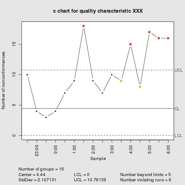
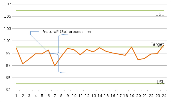
Upper Control Limit: This is also called UCL. The UCL is the top or maximum limit set for the data point(s). If all the data points in a Moving range are below UCL, it is considered that the process or monitored item is under control.
To calculate the UCL following formula is used
Upper Control Limit = Average of data points + E * Average of moving range data points
Where E is constant which has a specific value. The value of E is calculated from the below chart. For example, If you are calculating the Moving Range of 2 then the value if E is 2.66.
Lower Control Limit: This is also called LCL. The LCL is the bottom or minimum limit set for the data point(s). If all the data points in a Moving range are above LCL, it is considered that the process or monitored item is under control.
To calculate the LCL following formula is used
Lower Control Limit = Average of data points - E * Average of moving range data points
Where E is constant which has a specific value.
If all the data points in a Moving range fall between UCL and LCL, it is considered that the process or monitored item is under control.
If there are data points in a Moving range which crosses the UCL or LCL boundaries, it is considered that that data points is an outlier and need to be investigated. We need to find out the root cause of what and why the data point is an outlier; what needs to be done to fix this?
Average of Moving Range: The average is calculated for all the individual data points and for all the moving range data points. The below image will clear this; we have calculated the Average of all individual data points and average of all moving range data points.
Once you have the UCL, LCL, Moving Range, Average calculated; you can lay down the Moving Range Chart. The MR charts of above data are following:
As you can see all the data points falls within the UCL and LCL; so we can conclude that the observed item(employee productivity) is under control. In case there are outlier we can review to find out the cause and come up with the resolutions we need to take.
I hope you like the article. Please let me know your opinion via comments.