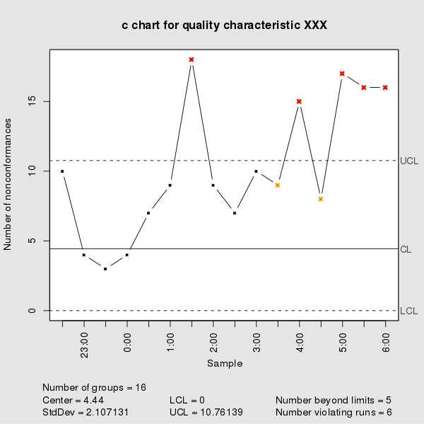
Control Charts and Run Charts are among Severn Basic Tools of Quality. The appearance of control chart and Run Chart are similar so they tend to create confusion some time.
Recently, I see this discussion in a popular PMP Forum. The healthy discussion did inspire me to write the differences and similarity between Control Chart and Run Charts.
| Control Chart | Run Chart |
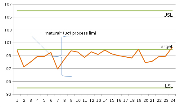
| Control Charts are used to check how a process is performing. Control Chart will tell you whether a process is under CONTROL or OUT OF CONTROL. | Run Chart are use to show and depict process trend. It helps to predict future trends. |
| Control Charts has a UCL (Upper Control Limit), LCL (Lower Control Limit), Mean on the chart | Run Chart has only two axis – one axis shows time/time-scale and second axis shows the events. It depicts whether a process is trending upwards or going downwards. |
| Example: ECG reports |
Example: Stock trends, Run rate graph, Error Rate of a employee |
| It is also called "Shewhart Chart" or "Process behavior Chart" | |
| Control Charts were invented by Walter A. Shewhart | |
|
|
Next: What is XMR Chart


